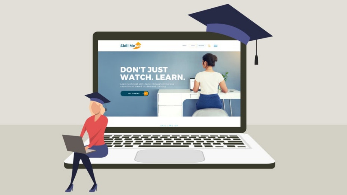
Every student feasting on knowledge in the web design field is well aware of the intense competition in this industry. And qualified and well-educated specialists are in high demand today, whether you are a future paper writer, teacher, or designer. For this reason, web design students need to stay flexible and creative when it comes to their clients’ demands. To help them get inspired and produce something worthy of appraisal, here are four web design practices.
Table of Contents
4 Helpful Web Design Practices for Students
Let’s see what four essential tips may help web design students to show impressive results and present a high-quality product.
Create a Plan and Follow It
Planning is always crucial, where it’s planning your work project or studies. Of course, web design is no exception. When a web design learner gets a college assignment or an order from a potential customer, they should plan their work. It is vital to provide themselves with step-by-step instruction on how to get everything done within the deadline. A good plan for designing a website involves three significant steps:
- Define the final goal of the future website. Understanding the purpose of the website allows students to realize what result is expected from them. This way, they can be sure they fulfill the needs of their client.
- Think about the website visitors and their wishes/intentions. After the purpose is identified, it is time to think about the expectations of future website visitors. What would they want to see there? What layout would be the most convenient for them?
- Make sure the website’s design and impression are consistent. Come up with a styling guide to ensure that color scheme, fonts, sizes, and other aspects are harmonious. It helps to create a striking website design.
Make Sure the Website’s Design is User-Friendly
Those who are only learning the ropes of web design definitely should consider this tip.
Almost any virtual platform is an online representation of a particular company, brand, etc. So it must provide excellent readability and easy navigation for the better comfort of prospective clients. Besides, it should serve as a place where customers can share their feedback.
Therefore, as a web designer, a student needs to guarantee that the audience will effortlessly find what they are seeking. Current web design learners should bear this in mind if they want to learn to build platforms with intuitive design.
Everything must be done to improve visitors’ improved convenience, from colors and fonts to the structure and disposition of elements. For example, if the future website will be used primarily by elderly visitors, consider boosting its readability. Simultaneously, when people who prefer quick and comprehensible navigation represent the target audience, work on simplifying website navigation. It is essential to include instant order forms and other fast-operating elements.
Guarantee That Search Engines Will “See” the Website
It is a well-known fact that not every online platform gets detected by search engines. So it is usually not featured in the search results – at least, not in the top 10. It may happen even if a website is functioning and contains useful and engaging information. All because a web designer didn’t consider that the site’s layout should be readable for both visitors and search engines. Thus, an online shop, a writing paper service offering academic aid, or any other virtual platform must be constructed as a search engine-friendly website.
The instruction on how to create a structure suitable for search engines is given below:
- Ensure a so-called breadcrumb trail. It is often referred to as secondary navigation. It helps a visitor realize if they are on the platform or not.
- Include headings, as they represent an essential part of text layout. Hence, they are critical for both audience and search engine optimization.
- Resort to bulleted lists wherever it is applicable. They simplify the process of finding information and keep users engaged.
- Display essential menu elements in front and on top so that readers will immediately set their eyes on them. To provide helpful links, use the footer.
- Do not use strident colors and too many images for the website for an organization not specializing in visual design, photography, etc.
- Introduce picture zoom and thumbnail view to ensure the faster page loading.
Opt for the Mobile-First Method
Undoubtedly, myriads of users surf the Internet through their portable devices – namely, smartphones and tablets. That is why it would be wise to view mobile gadgets as the primary option when designing a website. Moreover, it is better to opt for a mobile-first structure. It is yet another method to attract clients and back up their interest.
It has been proven that platforms built using the mobile-first method draw more attention. Thus, they are usually ranked higher in the search engine results. To ensure that the future website is engaging and efficient, implement a mobile-first design. It will boost the site’s traffic and conversion rates, which is the primary goal of every online platform.