Every email is sent with a clear vision about what your subscriber should do after reading it. Getting this ‘response’ is the ultimate goal for sending emails, and it is achieved using call-to-action (CTA) buttons. Crafting a persuasive subject line, preheader text, email copy, images, coding, and a lot more go into email templates for getting a click that results in a conversion.
The average conversion rate for email marketing in 2020 was 15.11%, down from 18.49% in 2018, which is still a good figure. If you are looking for some solid tips to create high conversion CTA buttons, you’re at the right place. I am going to share my top seven actionable tips to build CTA buttons that skyrocket your conversions. Read the blog ahead to get those seven tips.
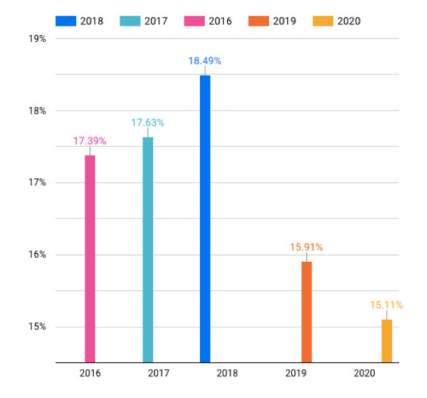
Table of Contents
#1 Use Words That Describe Action
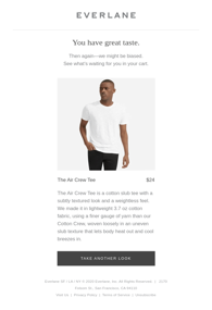
It won’t be an overstatement if I say that we are trained to respond to emails. This comes from our habit of replying to office emails, and you can use this habit to make your subscribers take action using words that describe it. Telling the reader what to do is one of the best ways to boost conversions since they end up clicking the CTA button while making the decision. Here are two examples of using action describing CTA text: ‘Take Another Look’ and ‘Take The Workshop’ give down below:

#2 Leverage Power Words
Power words are a universally applied CTA text strategy. Power words trigger a psychological reaction and drive conversions almost instantly. They are based on the thoughts or situations that have a strong emotional impact and can be recalled instantly. Some of the examples of power words for emails include Free, Gift, Spoiler, Shop, Top Secret, and Lucky. Usually, ‘Now’ is added as a suffix to it. This is a time-tested strategy, and I find brands using comparatively lesser copy in emails using power words, thus lowering the overall efforts. Here’s an example of using power words in CTA buttons coming from Judy:

#3 Keep Your CTA Button Clearly Visible
A lot of email marketers make this mistake: not making CTA buttons clearly differentiable from the rest of the email body. You can fix this easily by making a few changes to your design process. Make sure to use properly contrasting colors for your CTA button and the rest of the body. Also, I find that using a bigger CTA button size works like a charm. Go for eye-catching, bold colors that will help your call-to-action button stand out like in the below example from Zoom:

#4 Use FOMO To Trigger Action
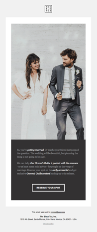
Next, I am bringing up a time-tested hack: Using FOMO. ‘Fear of missing out’ has almost become synonymous with digital marketing, and it can help you boost your conversion rates significantly. To use FOMO in your CTA button, you should always use a corresponding copy that describes why the user must click. This should include a time-bound incentive. In the below examples, you see how they have instilled a sense of urgency and combined the benefit within the CTA copy to trigger action:
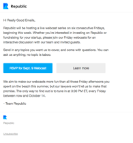

#5 Keep The CTA Button In Upper Fold
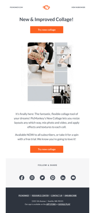
Almost 50% of the emails are accessed on mobile devices, and thus, you should keep your CTA buttons in the upper fold of your HTML email marketing templates. Keeping them accessible increases your odds of getting click-through since readers don’t need to read the entire message before deciding to click it. Of course, you can add the same button below after the copy ends in case your subscribers choose to read your entire message. Have a look at these examples to understand how you can make it easier for your readers to take action:

#6 Get Creative With Your CTA Copies
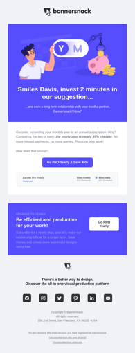
This tip works exceptionally well for brands with a knowledgeable audience that is highly engaged. Using creativity while writing down CTA copies can be especially rewarding if you know how to connect it with the email copy. This makes your call-to-action text look unique, making the subscriber read it properly instead of ignoring it out of habit. Here are examples of doing it right given by Bannersnack and Pitch:

#7 Place CTAs As Per Visual Hierarchy
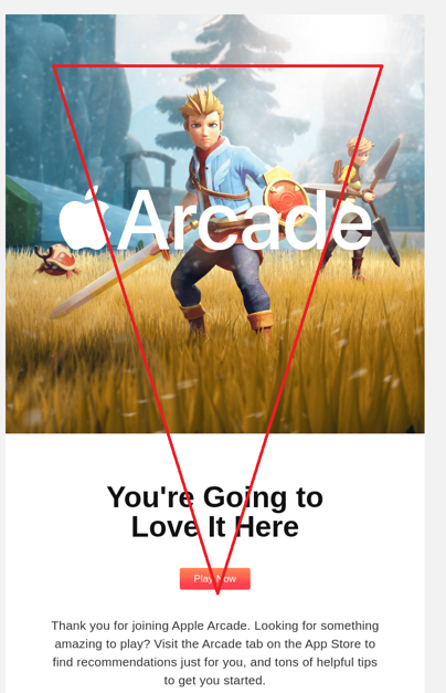
Smart email developers use visual hierarchy to place their CTAs in high conversion spots. You can use the visual hierarchy principles like an inverted triangle, Z pattern, F, and pattern to place the CTAs at areas where the reader is likely to look at naturally. This ensures that other elements don’t distract the reader’s attention. I have traced an inverted triangle in the below template for your perusal:
Summing Up
Coming towards the end, I would suggest you use A/B Split testing to find what works the best for you. It gives you a better understanding of what drives conversions for your brand, and you can improve the design of your CTA buttons accordingly. Keep them relevant, visually appealing, and keep using these seven tips to improve your conversion rate in 2021.