
When did the field of data science turn into the art of storytelling? Over the past 50 years, data visualization has become tantamount to data science, with the presentation of information increasingly requiring a gif or infographic to stay relevant. Beginning with Edward Tufte’s criticism of PowerPoint for its overly simplistic visuals leading to an oversimplification of cognition, data visualization has shifted from the occasional static chart to the indoctrination of infographics as data sources themselves. The growing view of visual analytics as a quintessential technological discipline hints that data visualization really is all it’s cracked up to be. Let’s talk about what data visualization is and why it really works.
Table of Contents
The Main Goal of Data Visualization
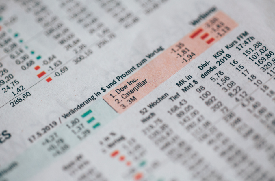
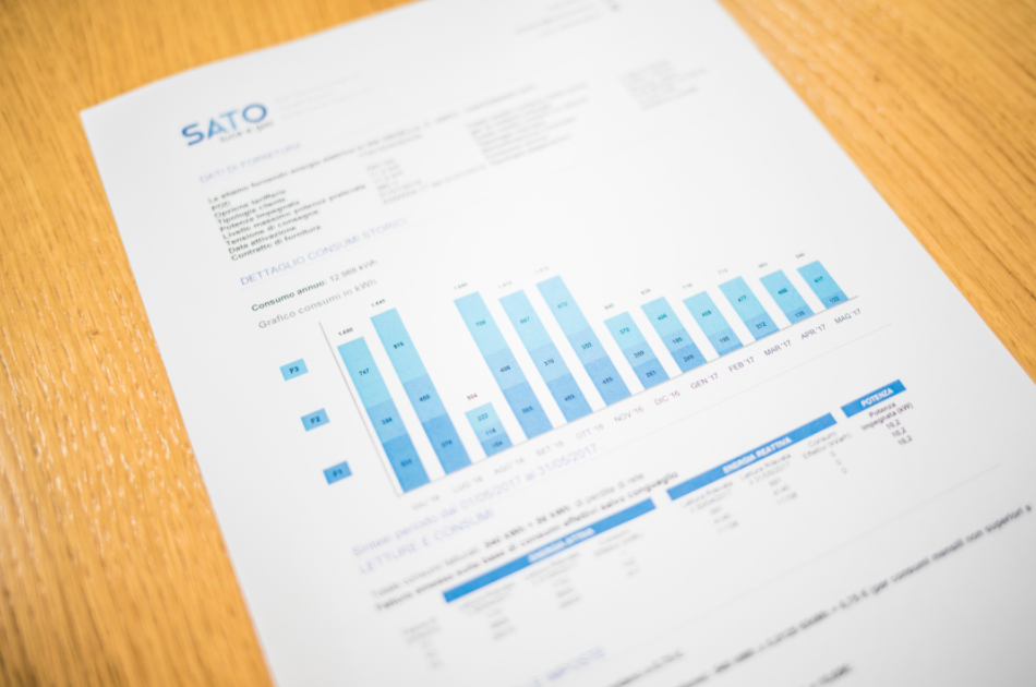
Data visualization allows for the presentation of big data in a small package. Using graphic representation of data, an analyst can present their conclusion without getting into the minutiae of the dataset. Scatter plots, pie charts, bar charts, and histograms are examples of statistical graphics that tell visual stories, providing deeper insight into a dataset than rows of data in spreadsheets ever could. These information graphics create a scientific visualization that allow for the comparison of data points between the x- and y- axes with a single glance. Data scientists can quickly present their conclusions; viewers can quickly understand large amounts of data. By saving your employees’ time, you implement one of the most important best practices into your workday. But quick comprehension is only the beginning of the power of data visualization.
Increased Understanding of Complexities
Data visualization allows a data scientist to highlight key points without their individual biases hindering objectivity. If an analyst presents numerical data analysis as statistical graphics, this visual display of quantitative information will either help others to draw the same conclusions as they did, or it will help others draw their own conclusions that in turn add to the collective understanding of the data set. Everyone has a different way of processing what they learn; information visualization creates a common ground on which your employees can come together and gain new insights. Complex, real-world issues become more easily digestible through the use of data visualization.
Interactive Data Visualization
An interactive visual representation can summarize large amounts of data faster than a presentation of multiple static graphs while integrating more information. Interactivity encourages users to draw their own conclusions because the visual representation of so many variables contextualizes the data in our world. This interaction allows for the presentation of data as it relates to a time series, so each viewer will automatically consider it in terms of their own personal experiences. When a user engages with a set of data presented as visual information, the data is more likely to evoke emotion. Suddenly the data scientist becomes the storyteller; all they must do is allow the infographic to play itself out as a captivating visual story arc.
See It To Believe It
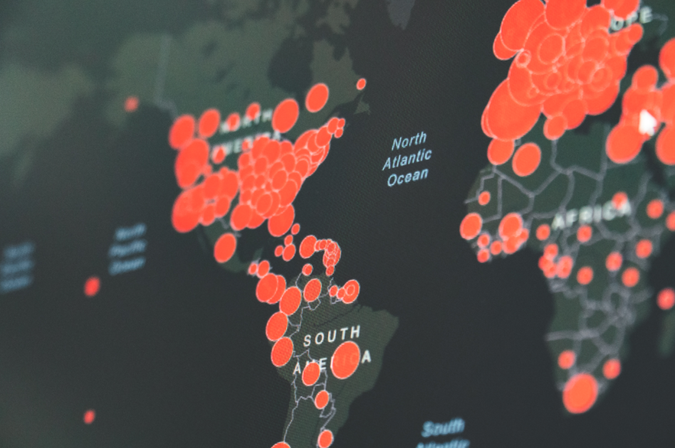
Let’s dive into the importance of using visuals for data presentation in the only way one should: through data visualization itself. Data visualization tools can turn an infographic into a solution; different shades of different colors on a line chart can alter the course of a natural event as deadly and relevant as a global pandemic. This article uses several infographics to present data regarding the spread of COVID-19 in the United States. The first is an interactive choropleth map and dashboard that shows the number of cases per square mile in March and April. The second and third are heat maps that help the viewer see the rapid increase of cases. This article from the Washington Post uses dots to illustrate the correlation between the movement of people and the spread of the virus. By creating a visual display of quantitative information, data analysts have created a platform for all people to understand raw data without having to know how to write in python. Data journalism that includes data visualization increases cognition not only for finance professionals or experts in visual analytics, but also for anybody who looks at those articles on their mobile devices.
Any group of people can benefit from the implementation of data visualization into their workplaces and their lives. Data points come alive through easy-to-understand statistical graphics, choropleth maps, or even a humorous gif. In order for data science to stay relevant in our constantly-changing world, visuals must be a part of the data presentation both for increased cognition of the data’s contextual relevance and for the integration of emotion as part of a solution.