In most cases, creating a website that is neat and clean can be the best choice for web owners. Stay away from very elaborate, busy backgrounds that are loaded with images. Simple can often be the better choice. Think about designing backgrounds using symmetrical shapes and/or polygonal instead of a lot of images or drawings.
Keep in mind, what shapes you choose for your design can affect how visitors will view your client’s site. With the right design, you can create a more appealing website that will have a positive effect on their business. Choosing the wrong shape can discourage and confuse your client’s potential customers.
It is crucial to understand and be able to apply some of the trendiest and most effective web design techniques today. The modern market is ruthless and rapidly developing. It is unforgiving toward web designers and top website designing companies that don’t adapt to change. So if you want to remain afloat, you should be one of the web design agencies or specialists that always strive to develop. Moreover, not all of the “new” trends are actually new. Geometry has been around forever. It’s in nature. It’s in everything we see around us and everything humans have ever created. This is, perhaps, one of the reasons people attribute various meanings to different shapes or associate a particular shape with a particular emotion. But geometry finds new and surprising ways and uses in the world of design. So, let’s take a look at some of the ways simple shapes affect web design.
Table of Contents
Triangles
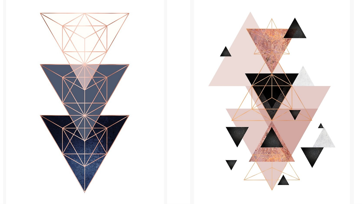
The symbol of the triangle goes back to ancient times holding many different meanings like the Pyramids of Egypt. The triangle can have different messages in web design, depending on how it’s drawn or where it’s placed. Unlike some other geometric shapes, the triangle draws the eye to its peak.
The positioning of the triangle either upward or downward can symbolize different meanings as well. In an upward position, the triangle can represent direction, power, or authority. The triangle is commonly used for warning signs to caution pedestrians or drivers of changes due to accidents or redirecting them elsewhere. Sometimes the triangle is upside down for various di\rections.
There are companies that use the upright triangle in their logos to represent a form of authority or upside down to show state-of-the-art concepts within their operations. For instance, Mitsubishi tells potential customers they are the leader in the automotive industry so you can trust their brand. Another corporation has an upside-down triangle stating they pay attention to details in automaking for excellent quality.
Circles
Circles represent a more modern look used by designers and graphic businesses. As an example. A business that offers printed materials would not use circles as their items are rectangular and would easily conflict with circles.
Due to the shape, circles represent movement and are infinite. The circle is often used to get people browsing the internet to take action on these sites. Such as clicking on a button, or on a Call-To-Action. Circles can be difficult but if implemented the right way, you can get potential customers on your client’s site to perform various actions.
Therefore while creating your web design projects, you should use circles infrequently so when a visitor sees a circle, it catches their attention. On the other hand, it’s better to find a different shape, all together, if you are creating a logo. You want to ensure your client’s logo stands out from the crowd.
Squares & Rectangles
All your de\vices along with monitors, and screens are rectangular and square which is literally basic and easy to use. On the other hand, you can get lost in a mountain of these rectangular and square shapes for web and graphic designing. It will be more difficult for your client to stand out from the crowd.
Rectangles and squares are very commonplace in web design and usually signifies conformity, balance, and equality. You can visit any web page and find plenty of squares and rectangles for so many uses. They are used for content to drop-down menus and other areas across the bottom of the page. People are more comfortable and at ease seeing these two common shapes everywhere on a page because so much can be located on the same page.
Too many squares and rectangles on a page can look crowded and quite honestly very plain. There’s no standing out from the crowd because there are thousands of sites that look exactly the same. You will have to march to your own drummer by curving the square’s edges or tinkering with the frames and borders if you want something simple but still allow your client to stand out from the other sites.
Conclusion
Web and graphic designers have a gift for style but in some cases, they get hung up on specific shapes and decide to use the same choices repeatedly. There are several other shapes that have not been brought up in this article such as polygons. You can use any of them for your client but you should make sure what each shape’s message is sending before digging in. Each shape can have an effect on your client’s customers.
Take advantage of the things described above to try and create amazing websites for your customers. Your websites should help your customers establish a connection with their audiences. Thus, it is essential for you to create things they can relate to and see your clients’ brands behind graphics, shapes, colors, and all the other design elements you implement. But, all in all, geometry is always there and it’s totally up to you to make the most out of it.