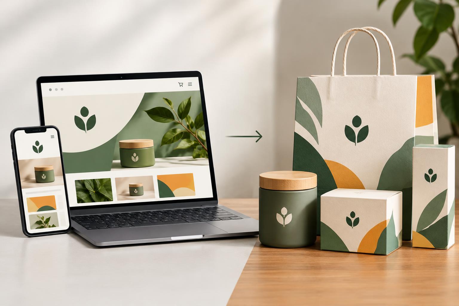
Procter & Gamble’s own research says that 70% of purchase decisions are made “in front of a shelf, not in front of a screen.” That means that beauty founders can’t just think about how their brand translates to Instagram. What looks great on your phone screen may look terrible under fluorescent retail lights, sandwiched between 20 other competing products.
Table of Contents
Why digital-first identities break at retail
Most beauty brands now start life entirely on screens. The logo gets designed in RGB, the hero shots get lit by a ring light, and the whole identity gets approved by a founder looking at a laptop. That process produces something that looks great in a feed. However, this does not take into account how the same brand mark behaves on a frosted glass jar lid under store lighting, viewed from three feet away, at an angle, by someone who isn’t specifically looking for it.
Most digital-native beauty brands are simply not equipped for this transition to brick-and-mortar. Their identity systems were never built to exist beyond a picture on a screen.
Point one: the logo is one module, not the whole identity
In beauty brands especially, it’s not enough for identity designers to create a logo lockup and call that an end to the design process. That one mark won’t work everywhere without help: as an app icon, on the face of a 100ml perfume jar, stamped on shipping boxes, scrolled across shelf talkers, and more. Each of those sizes and venues requires a different relationship between mark, wordmark and other supporting design elements. A flexible system treats the logo as a module in a kit and includes a primary identity mark, a simplified version that works at very small sizes, a horizontal lockup for use on wide labels, and guidelines for which application goes with each, among other components.
Make sure the agency you work with knows that a beauty brand design process includes color proofs for print and physical mockups and prototypes of the brand in its many forms, not just a deck of RGB screen mockups. Otherwise, the design process is only half complete.
Point two: color is a range, not a hex code
It’s impossible to reproduce a brand color exactly in the three process color spaces now in play in the market – RGB for iPhone screens, CMYK for offset-print processes and Pantone spot color for some specialty processes like foil stamping – given differences in substrate and the way they reflect light. Indeed, it’s chasing an illusion – there is no color in nature that’s the same on anything else but the context it’s seen in.
What you can do is set out an acceptable range, and provide the precise color breakdown for each color space (RGB hex, CMYK breakdown for mass offset prints, Pantone reference for foil stamps) and specify the type of substrate and lighting conditions each applies to, to ensure no one is left guessing what “true” means.
Point three: typography has to survive the legal stack
Beauty packaging is dense with important information, ingredient lists, net weight, usage warnings, batch codes and regulatory marks – all of which need to be legible on a range of surfaces, from flat to textured to curved. An ornate, display typeface that looks great on a hero shot can become illegible when scaled down (six point type is common for ingredient lists) to wrap around a cylindrical container.
Most beauty brands use at least two fonts. One display font (or a custom typeface) that carries personality and houses the brand name and headlines. And another, workhorse font that ensures legibility for body copy and legal information, even down at small sizes. Not all fonts will work down to six point and some may struggle when kerned or warped around textured or curved surfaces, something that can be missed when a designer simply chooses a font in a flat Figma mockup.
Point four: materials decide what the identity is allowed to do
Designing for packaging is hard because packaging choices affect the final look of the design in ways that are not always obvious from a digital file. Matte laminates absorb light, reducing the perceived saturation and deepening of colors. Gloss laminates reflect light, brightening and enhancing the saturation of colors. Foil stamping adds shine, but is not capable of fine detail the way flat printing is. Embossing adds texture and interest, but can reduce the intensity of colors over the raised areas. Uncoated recycled paper absorbs ink differently than coated paper and can make colors appear flatter and warmer than they do in a digital proof.
These aren’t problems that can be fixed after the first run, but considerations that should be taken into account from the very beginning of the design process.
Point five: validate at shelf distance, not at arm’s length
Here’s the harsh reality of planograms: up close a busy, sophisticated and detailed label may look superb. However, from the shelf distance of 3-6 feet, often viewed at a slight angle, it can become indistinguishable from the dozen other labels battling it out for space on the same shelf strip. The cure for this issue, and one unfortunately overlooked? Print the design out in full scale and view it as a potential shopper may.
Hang a printout on the shelf (or what passes for a shelf in prototypes) and view it from the distance and angle a shopper would see it. Squint, just for fun. If the brand name and the primary color swatch can’t be made out from that distance and visual, then all the fine polish you put into it from up close won’t be of much use.
Point six: renders lie, prototypes don’t
Every identity direction that survives to final rounds should get built as a physical prototype and compared side by side against its digital render, under the same lighting conditions the product will actually face at retail. This step catches problems that no amount of screen-based review ever will:
Color shift under ceiling fluorescents, a glare off a shiny bottle cap, a label that puckers around a rounded shoulder. None of these would ever be caught in a digital render test. Sure, renders are a blast, and a quick way to get early feedback. But they’re garbage at showing you the end result. Textures can be grossly exaggerated, a perfect soft-touch matte looks beautiful in a render, in real life the tooling run might have visible seams, inconsistent coating, or a surprising change in radius that throws off your label placement.
Point seven: design for the thumbnail and the crop, too
Digitally native beauty brands sell through their own sites, but they also sell through marketplaces with their own rigid image rules. Amazon-style retail listings demand white-background hero shots, specific crop ratios, and zoomable detail images that will crop tight on the label’s focal point whether the brand likes it or not.
Logos are an important part of a company’s visual identity, so it’s essential for D2C brands to consider proper clearspace and optimal placement of key brand elements for online use. If the primary logo placement sits too close to the edge of a label, a marketplace’s auto-crop or thumbnail generation can slice right through it. The smallest digital rendering, a 32px app icon, and the smallest physical shelf unit, a travel-size compact, are functionally the same design problem: everything non-essential drops away, and only the clearest, simplest version of the mark survives.
Timing matters as much as design
It’s understandable that many beauty brands that sell through retailers will want to do a visual refresh of their brand identity in conjunction with its online debut. However, retailers typically plan their in-store experiences, such as layouts and product displays, around different considerations. There may be planograms in place that are hard to come by. In-store displays may be timed with other events or seasons. Brands need to develop a plan that takes these retail considerations into account.
Existing inventory and packaging may be present on shelves for months after brands announce a new look online. This creates dissonance for shoppers who may be confused to see a brand’s old packaging in-store, after viewing a brand’s new visual identity online. A plan should be developed to determine how to phase-out older packaging, and not solely focus on announcing and releasing new branding and identity materials.
Sustainability constraints aren’t an afterthought
Bringing these constraints into the conversation at the start of identity design, rather than after the logo is locked, avoids a painful redesign later. It also tends to produce stronger, more disciplined design: fewer finishes, cleaner color systems, and typography that has to earn its place rather than relying on a special technique to look premium.
If a brand has built its visual identity around a foil stamp finish, for example, and later decides to commit to mono-material recyclable packaging, it may find that its signature foil finish is no longer possible without compromising its recyclability claims. By recognizing at the outset any potential limitations on your visual identity’s application, ending up with a logo that can’t live up to its promise of foil finishes later on can be avoided.
The unboxing is part of the identity, too
A heavy glass jar with a satisfying magnetic-close lid reinforces a premium positioning in a way no screen could ever match. A flimsy cap or label peeling at the corner undercuts months of careful content work in about three seconds.
Beauty brands have been selling stories for a while now. Their digital brand promise lives in video, copy and imagery. Their physical brand promise lives in weight, texture, sound and the sequence of a box opening. The moment when you get to touch a brand is when its digital story is either confirmed or contradicted by the object in your hands.
None of this is really about taste. It’s about identity systems being built for one medium, asked to perform in another, without the physical testing that would have caught the gap. The brands that make the DTC-to-shelf jump well are the ones that thought through packaging materials, legal typography, shelf distance and unboxing as design problems, from day one, not as details to sort out after the logo got approved.